Styled Native View
This component is build on React Native View which is the most fundamental component for building a UI, View is a container that supports layout with flexbox, style, some touch handling, and accessibility controls.
Usage
App.tsx
import { StyledWindView } from "expo-nativewind-components";

export default function App() {
  return (
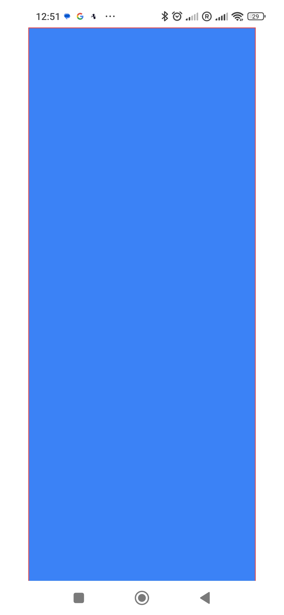
    <StyledWindView className="bg-blue-500 h-screen w-[80%] border border-red-500 mt-10">
      {/* Your content here */}
    </StyledWindView>
  );
}
And you can pass the style prop along with the className. The style prop will override the styles from the className. The final width of the below example will be 200 as the style prop is overriding the className.
App.tsx
import { StyledWindView } from "expo-nativewind-components";

export default function App() {
  return (
    <StyledWindView style={{width: 200}} className="h-screen w-full justify-center items-center">
      {/* Your content here */}
    </StyledWindView>
  );
}
Props Reference
You can find all the possible props that you can pass to the StyledWindView component below from the official React Native documentation (opens in a new tab).